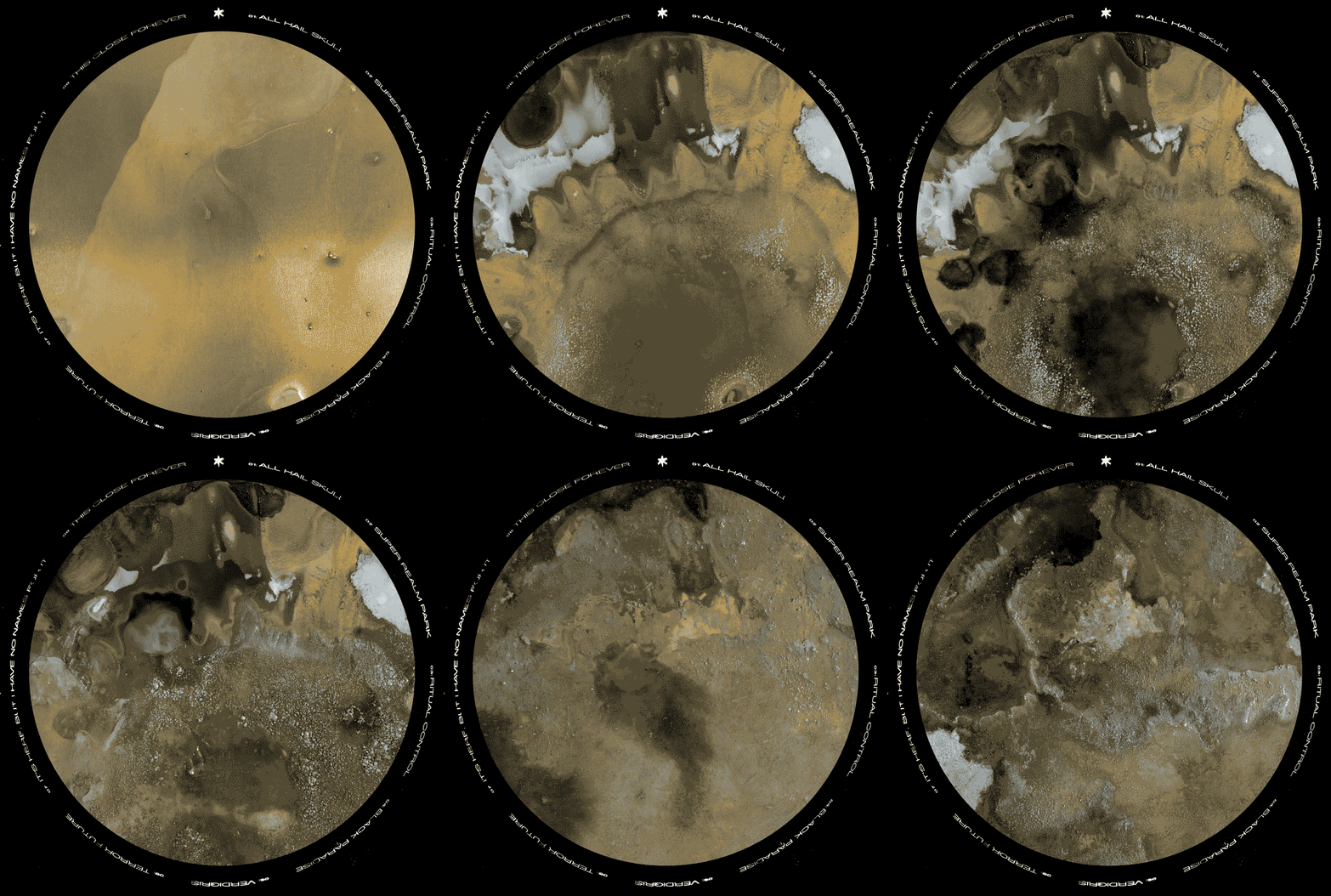

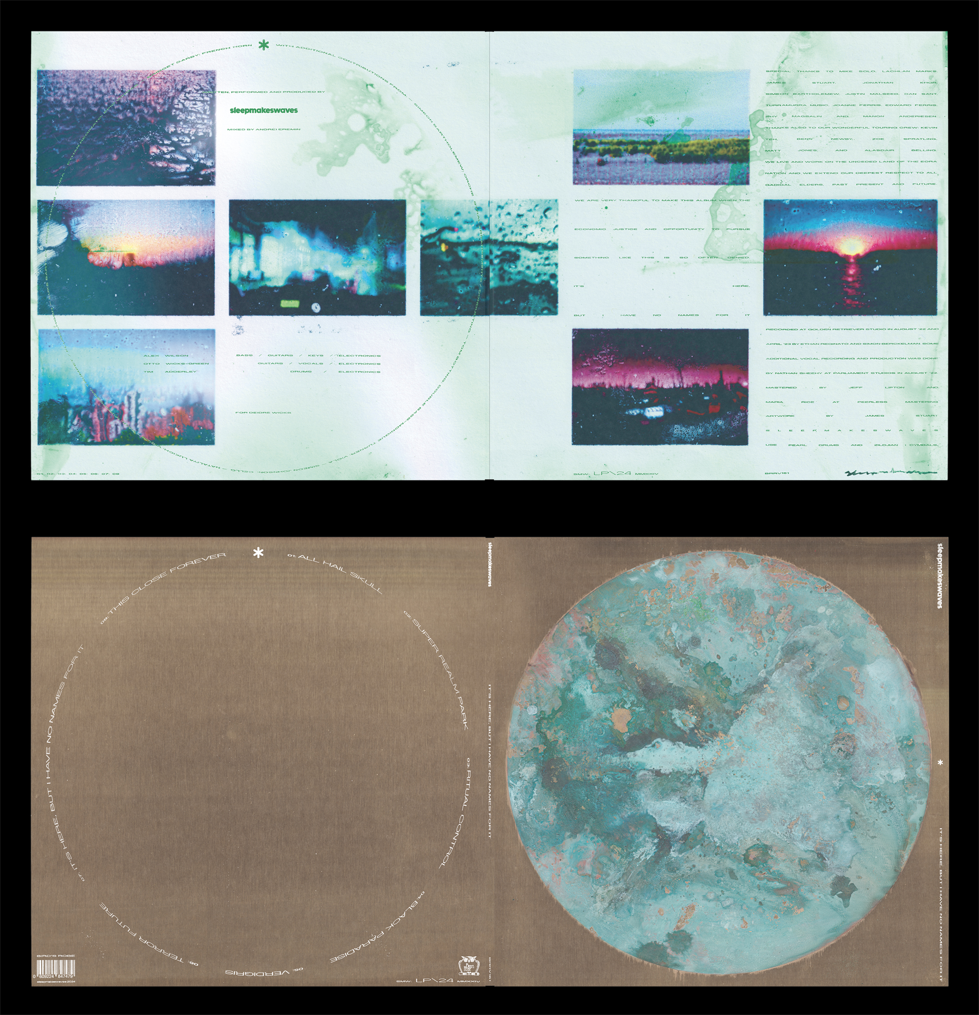

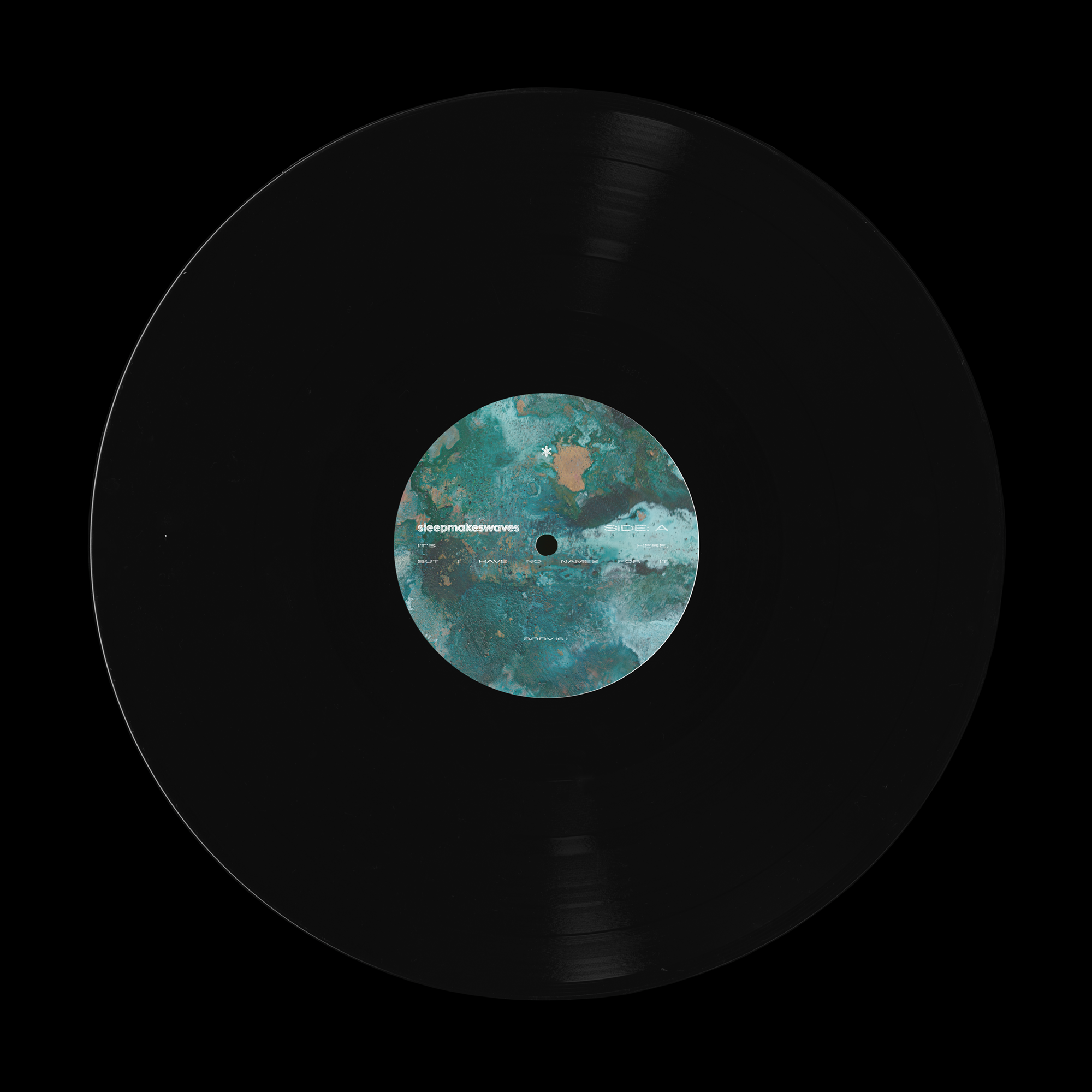



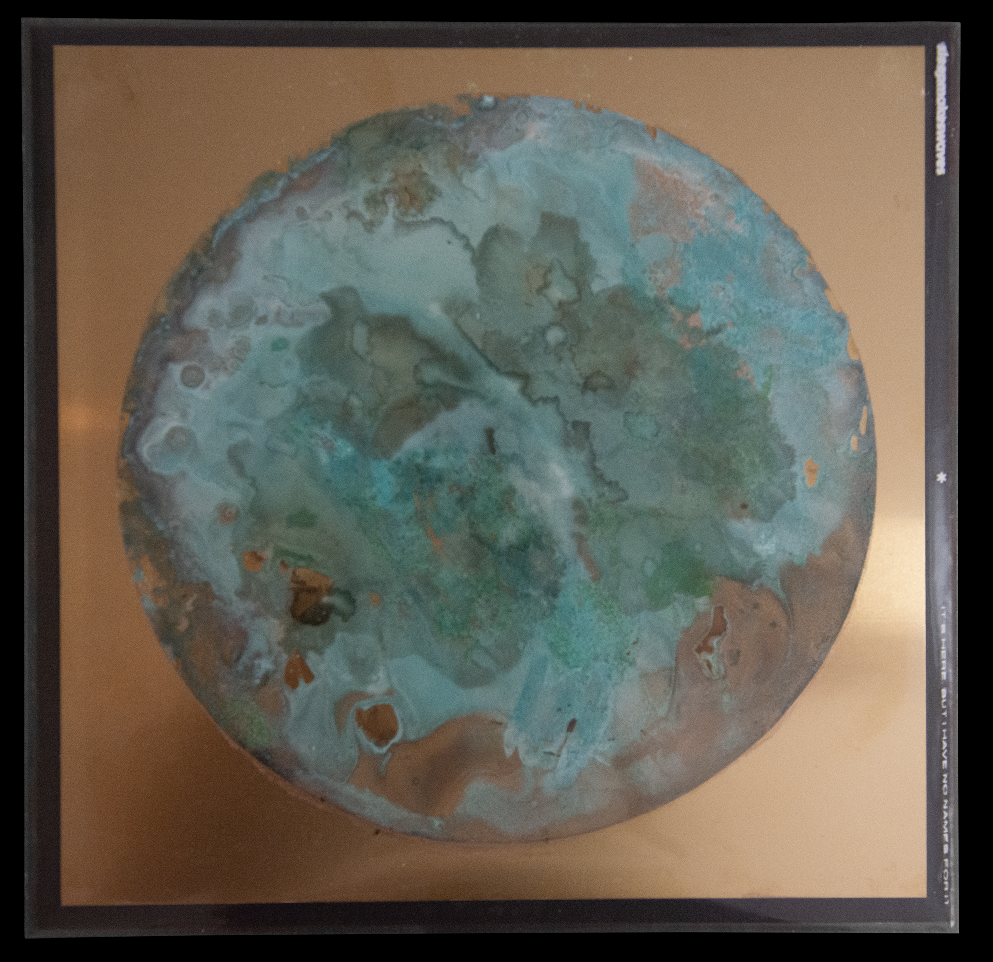
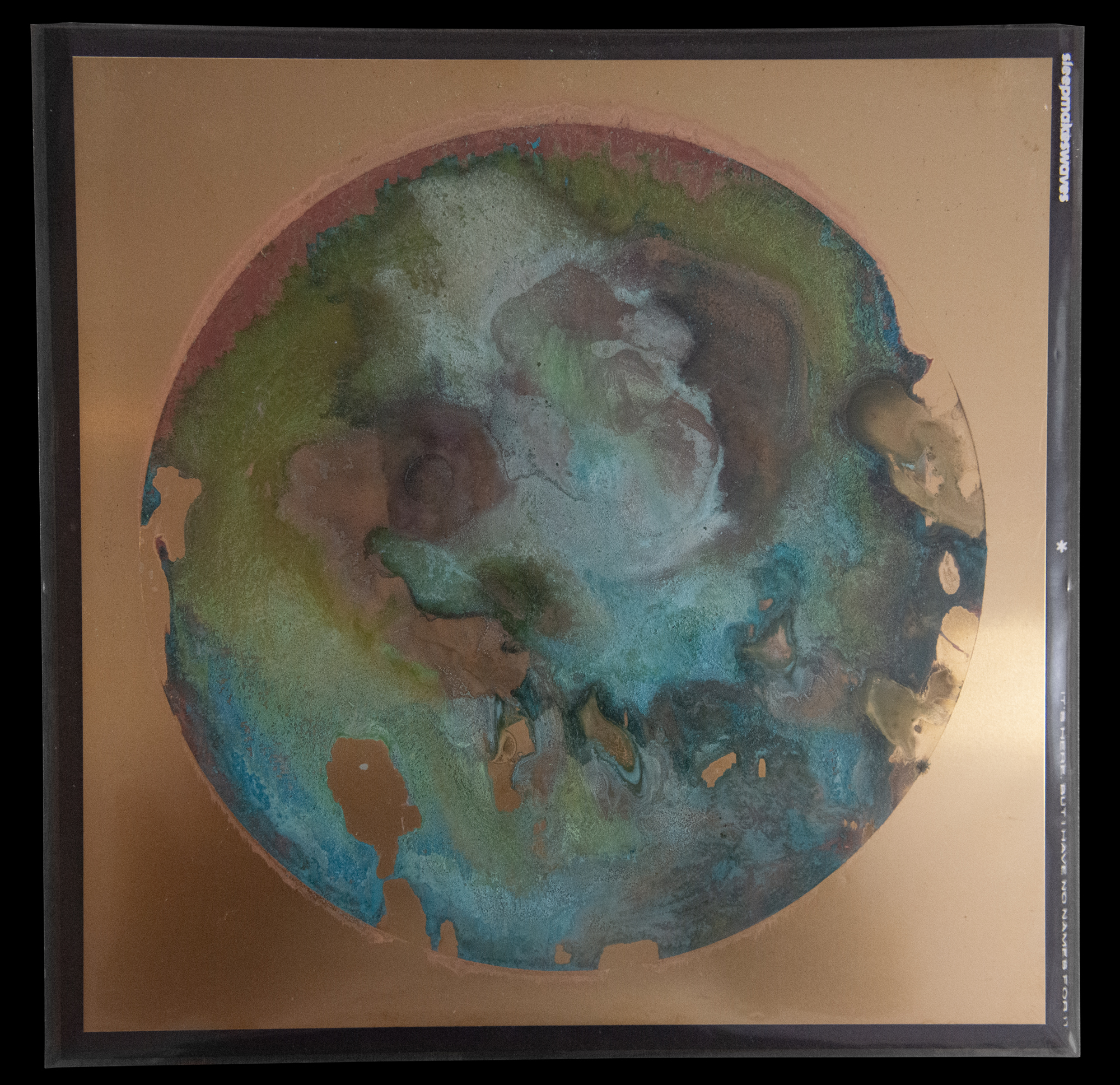

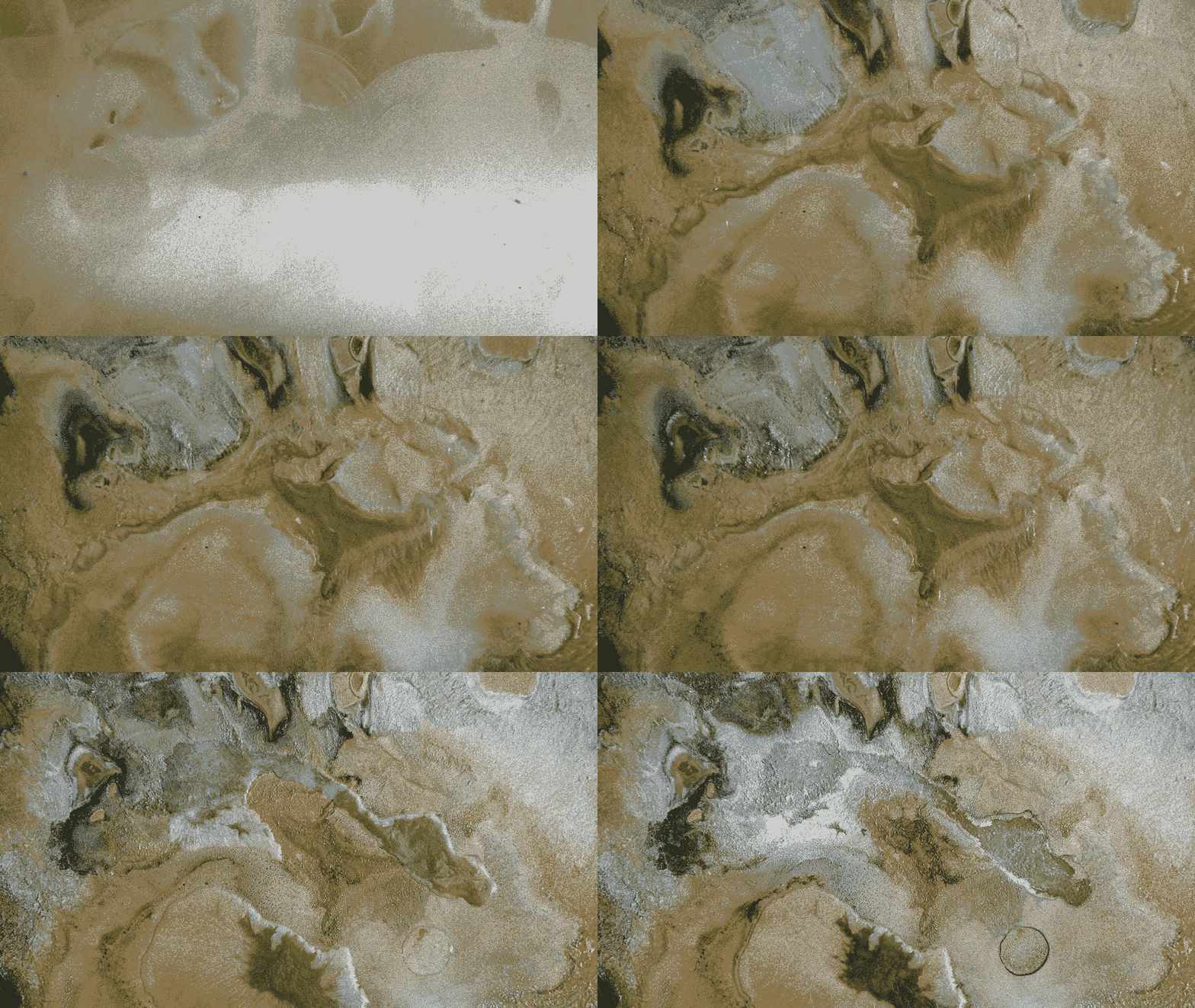
This fourth major release for sleepmakeswaves marks about thirteen years I have been working with the band. For It’s Here But I have No Names For It we let the logo take a back seat for a while, instead focussing on the process of oxidizing brass. This big green circle is actually formed by the natural process of oxidation, and therefore might reflect an interesting interpretation of the idea of entropy, or inevitable change. Bands form, create, change, and fall apart again. I think we are trying to nod to this in creating something that simply visualizes that inevitability. It has been liberating taking myself out of the picture to an extent, and with that my deep-set tendencies to render things in a particular way.
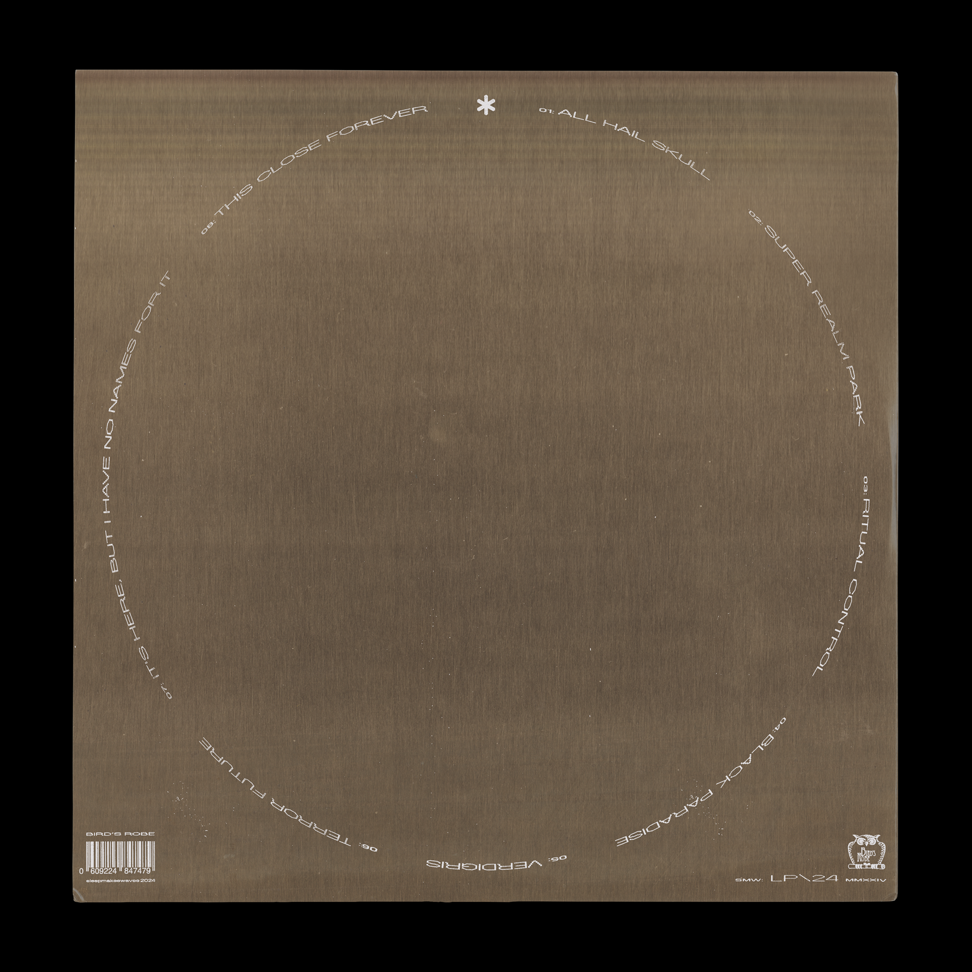
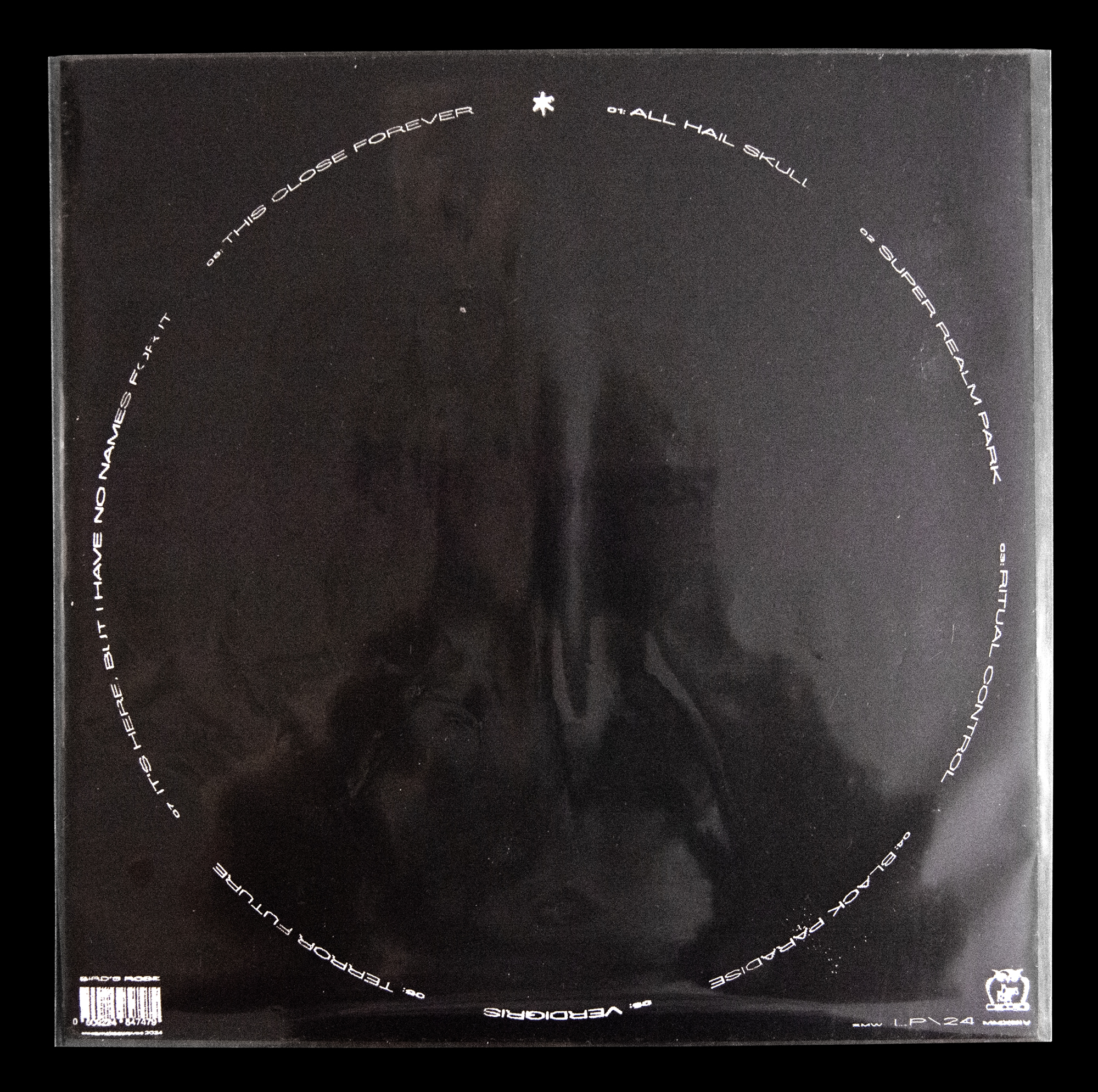
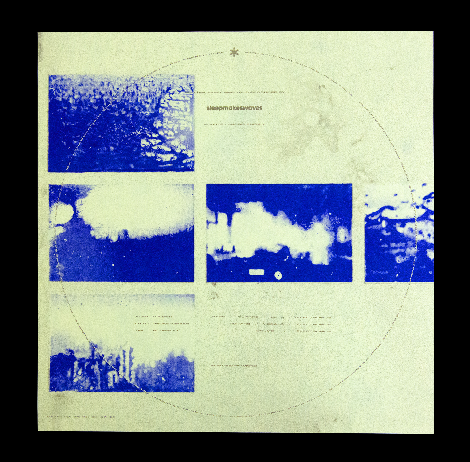
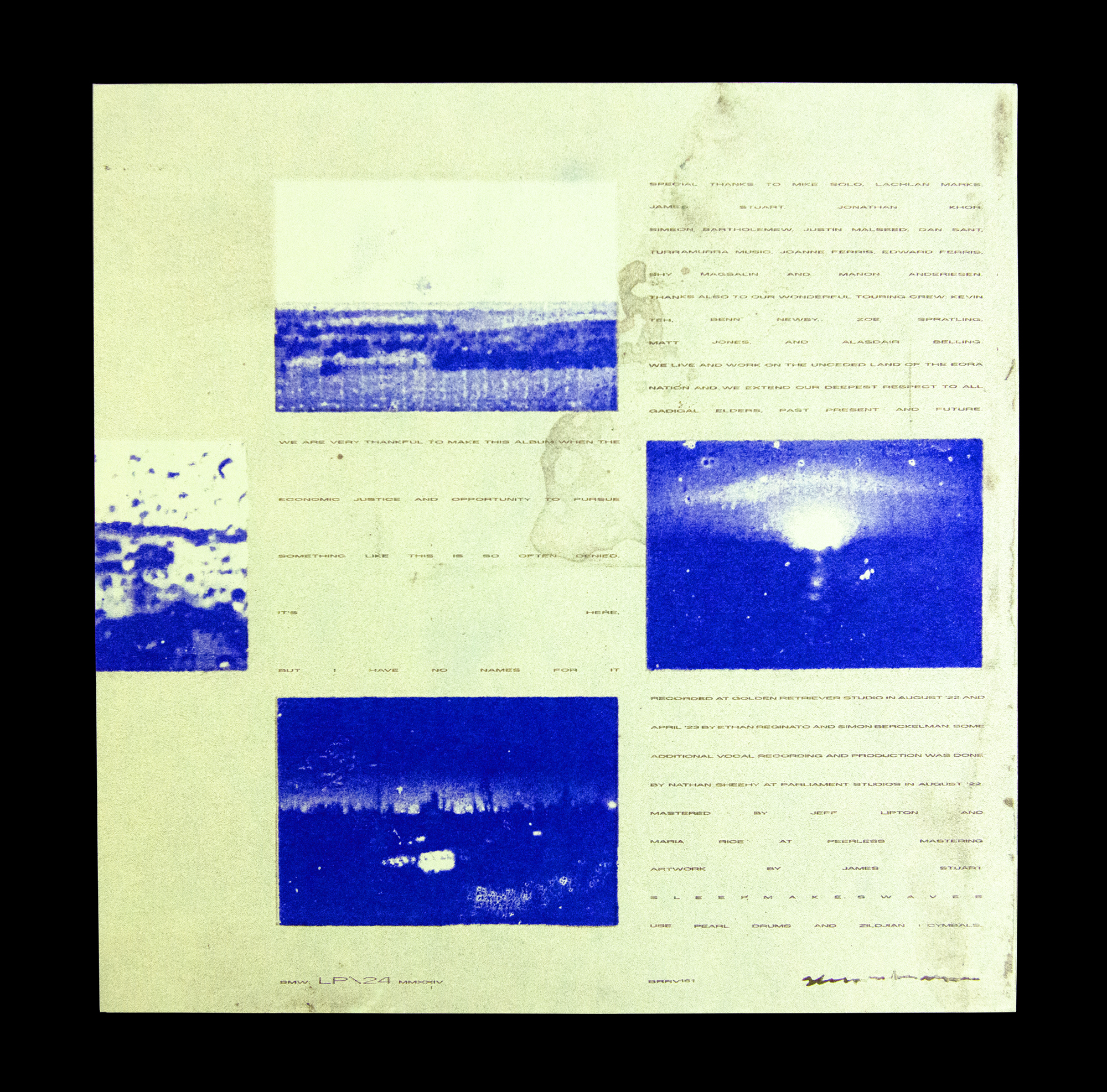
If you’re seeing six different covers, or green circles, here, that’s because aside from the main digital artwork – featured across the main run of vinyl and CD packaging – I have oxidized five more brass sheets, which have been assembled into special LP packaging. These are actual brass record covers. The special edition packages come with a custom screen printed vinyl outer sleeve, and risographed inserts on mint green heavy weight stock.
If you’re seeing six different covers, or green circles, here, that’s because aside from the main digital artwork – featured across the main run of vinyl and CD packaging – I have oxidized five more brass sheets, which have been assembled into special LP packaging. These are actual brass record covers. The special edition packages come with a custom screen printed vinyl outer sleeve, and risographed inserts on mint green heavy weight stock.
Client: sleepmakeswaves